
Quick Edit for Fast Editorial Workflows in Axinom Mosaic
A Streamlined Way to Edit Media Entities Directly in Explorer
November 6, 2024
What is Quick Edit?
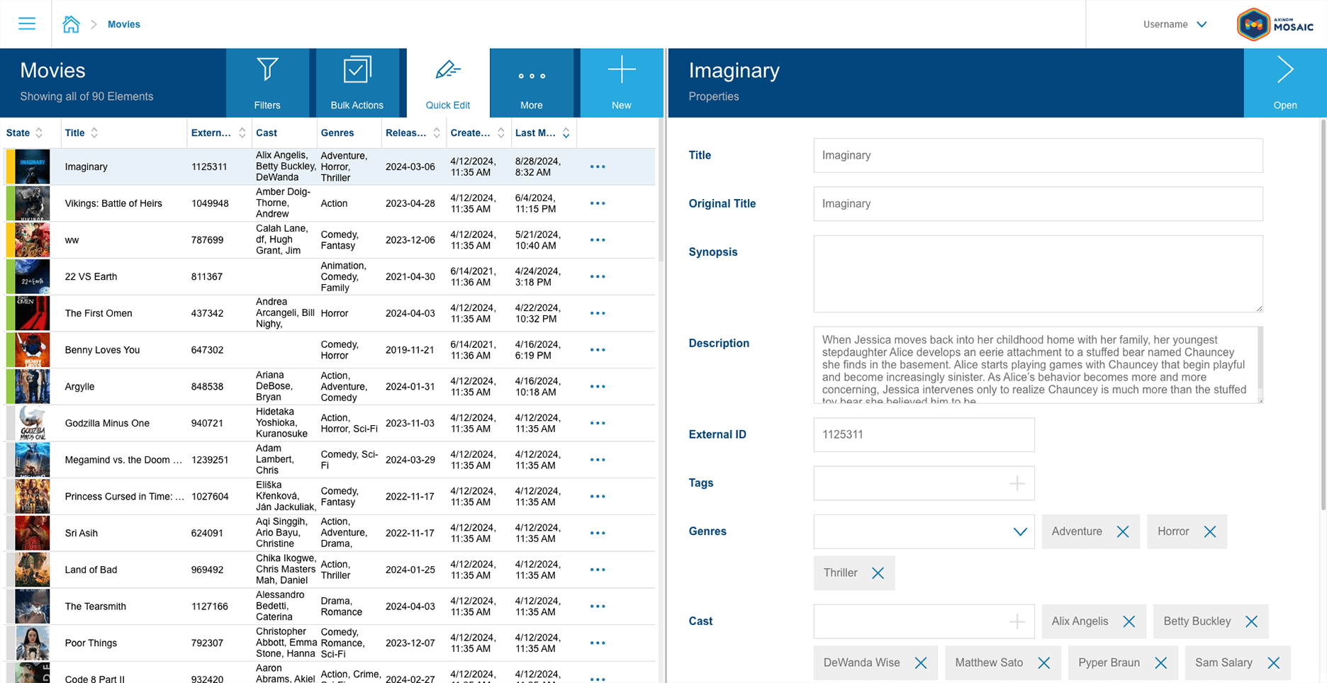
Quick Edit is a productivity-boosting feature inside Axinom Mosaic management system that allows individuals to streamline workflows by allowing quick, in-place editing without the need to navigate away from the main Explorer Station. This is achieved by adding a panel on the right side of the Explorer Station that displays a Quick Edit form for the selected entity. The user can edit the entity in the Quick Edit form and save the changes without leaving the Explorer Station, making the editing process faster and requiring fewer clicks.

-
Whenever the user selects another item in Explorer, a save action is called on the content of the Quick Edit form.
-
When Quick Edit is activated, the filters panel is hidden to save screen space. However, the user can make filters visible again by clicking the "Filters" button.
Quick Edit in Axinom Services
Starting from September 2024, we began offering built-in support for Quick Edit as part of the Mosaic frontend libraries. This means users can immediately take advantage of this feature without additional setup for supported microfrontends.
Axinom has implemented Quick Edit for the microfrontends of the managed services, such us a Video or Image Service. You don’t need to spend any extra effort to enjoy Quick Edit in managed services.
Axinom also implemented Quick Edit in the Mosaic Media Template. If you start a project on the latest template, you will already have Quick Edit available for the standard media workflows like Movies or TV Shows. You can use them as-is or further adjust as described below.
Implementing Quick Edit in Customizable Services
Even if your project is based on an earlier version of the template, you can easily add Quick Edit by yourself. Enabling Quick Edit is simple and only requires a few development actions.
You can add a Quick Edit option to an explorer by passing any React component using quickEditRegistration property:
        <NavigationExplorer

           // The 'quickEditRegistrations' prop allows you to register quick-edit components

           quickEditRegistrations={[

               // Registering a quick-edit component with the label 'Movie Details'

               { component: <MovieDetailsQuickEdit />, label: 'Movie Details' },

           ]}

        />
Additionally, you can customize your Quick Edit setup by adding a label, an icon, and even a function to render a details link. This function can allow users to expand Quick Edit into a full details page view if needed.
As you can use any React component here, your Quick Edit panel is not limited to only providing editing capabilities. You can, for example, render some graphical chart or visualization based on the selected item or pull information from an external service.
Reuse an existing Details form
The simplest solution is to reuse the component that you already have in the Details station. You don’t have to develop anything new, and the editors will have the same experience as when going to the details page.
The only tricky question is - how the form will get the ID of the selected entity?
A typical details station reads the ID from the URL. In case of Quick Edit, the ID will be passed by the Explorer.
So you have to parametrize the form, and set the ID differently when called from an Explorer or from a standalone Details station.
1. Rename the Details component to, say, DetailsForm and accept a parameter there (MovieDetailsFormProps here is an interface containing a movieId property):
        export const MovieDetailsForm: React.FC<MovieDetailsFormProps> = ({

           movieId,

        }) => {

         …
2. The actual Details stations reads the ID from the URL and passes to the DetailsForm:
        export const MovieDetails: React.FC = () => {

           const movieId = Number(useParams<{movieId: string}>().movieId);

           return <MovieDetailsForm movieId={movieId} />;
        };
3. The Quick Edit form used by Explorer uses the same component. It receives the QuickEditContext, from which it can find the currently selected item and use its ID:
        export const MovieDetailsQuickEdit: React.FC = () => {

           const { selectedItem } =

             useContext<QuickEditContextType<MovieData>>(QuickEditContext);

           return selectedItem ? <MovieDetailsForm movieId={selectedItem.id} /> : null;

        };
For a full example check the Mosaic Media Template.
The QuickEditContext contains also other useful information, such as a refresh function, which can be used to update the Explorer state. See here for details.
When a Form Station is placed within a component registered as a Quick Edit it exposes additional behavior to support Quick Edit, such as registering a save-callback. See Quick Edit documentation for more details.
Custom Quick Edit form
If the Details station is too crowded, it can be beneficial to develop a separate view for Quick Edit, using another instance of a Detail-Station, concentrating on the most frequently used fields.
For development of such a component, everything applies that applies for a regular Details station.
Quick Edit component receives at runtime a Quick Edit Context, with a few useful properties, such as the selected item, a refresh-function and a possibility to register a custom save-function.
Multiple Quick Edit forms
It is possible to register multiple Quick Edit views. This can be useful, if an entity has a lot of properties, combined into logical groups. Each Quick Edit view will allow editors to concentrate on a specific use case.
If your Details station already has sub-stations, reachable using Action Buttons, each of these stations can be used for Quick Edit as described above.
For example, for a Movie Details station, there can be three different views for Quick Edit:
-
Main properties
-
Images assignment
-
Videos assignment
The explorer property quickEditRegistrations accepts an array, thus easily allowing multiple registrations.
        return (

              <MovieExplorer

                title="Movies"

                stationKey="MoviesExplorer"

                kind="NavigationExplorer"

                calculateNavigateUrl={(item) => `/movies/${item.id}`}

                onCreateAction="/movies/create"

                bulkActions={bulkActions}

                quickEditRegistrations={[

                  {

                    component: <MovieDetailsQuickEdit />,

                    label: 'Movie Details'

                  },

                  {

                    component: <MovieVideoManagementQuickEdit />,

                    label: 'Manage Videos',

                    generateDetailsLink: (item) => `/movies/${item.id}/videos`,

                  },

                  {

                    component: <MovieImageManagementQuickEdit />,

                    label: 'Manage Images',

                    generateDetailsLink: (item) => `/movies/${item.id}/images`,

                  },

                ]}

              />

        );
What’s Next? Bulk Edit!
Bulk Edit is a combination of Bulk Operations and Quick Edit.
Mosaic already supports Bulk Operations. Select multiple items and apply one of the bulk operations, such as “Delete” or “Publish”, by pressing the desired button from the toolbar and this operation will be applied to all selected items. With Bulk Edit, you will be able to set values for multiple properties and apply this change to all selected items.
Stay tuned to read more about Bulk Edit in detail or book a meeting with our Chief Developer Advocate to learn more about Quick Edit, Bulk Edit, and how your development team can leverage Axinom Mosaic!


